Open the sweep UI
To open the Sweep UI, navigate to the W&B App. Choose the project that you specified when you initialized a sweep. W&B redirects you to your project workspace. Select the broom (Sweep) icon in the project sidebar. From the Sweep UI, select the name of your sweep from the list. The Sweep UI lists every sweep in the project and serves as the entry point for inspecting an individual sweep’s runs and charts. The sweep list shows each sweep’s state (State), creation time (Created), who started it (Creator), how many runs finished (Run count), and total Compute time. For a grid search over a discrete search space, W&B also shows Est. Runs (the expected number of runs). Open a sweep from the list to pause, resume, stop, or cancel it from the app. For the same controls with the CLI, see Manage sweeps.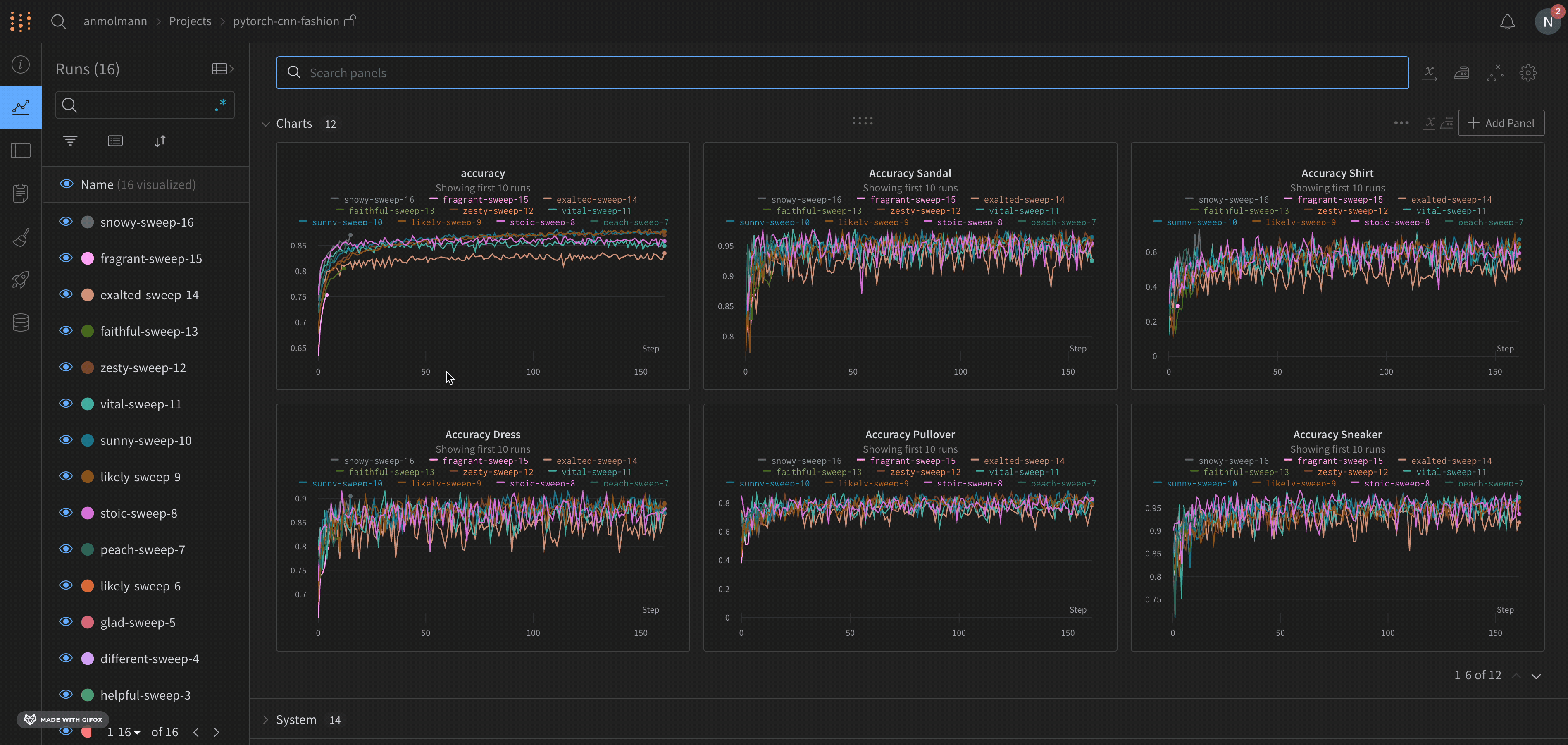
Default visualizations
By default, W&B creates a parallel coordinates plot, a parameter importance plot, and a scatter plot when you start a sweep job. The following sections describe each of these default visualizations and how to customize them.Parallel coordinates plot
Parallel coordinates charts summarize the relationship between large numbers of hyperparameters and model metrics at a glance. For more information about parallel coordinates plots, see Parallel coordinates.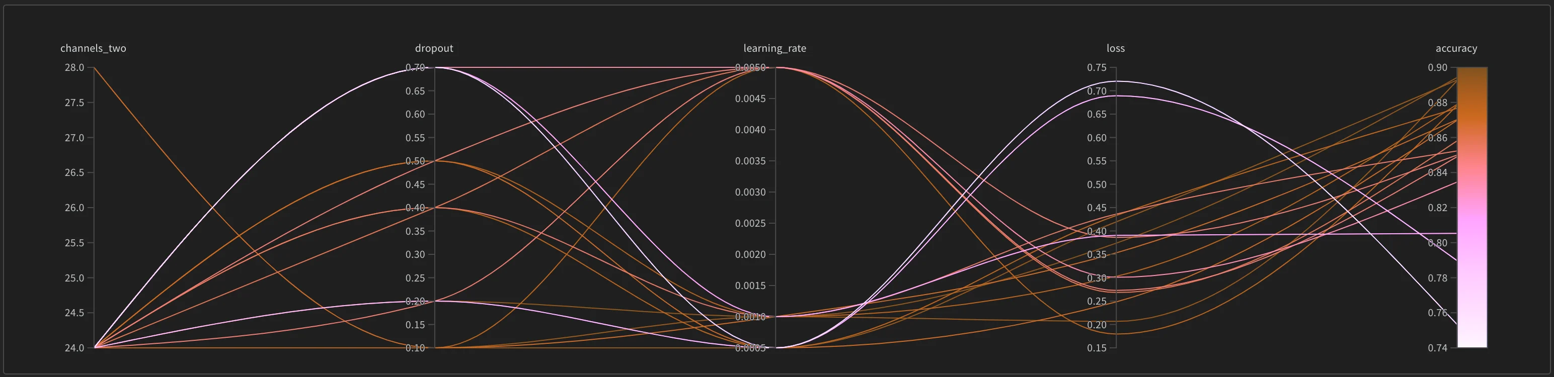
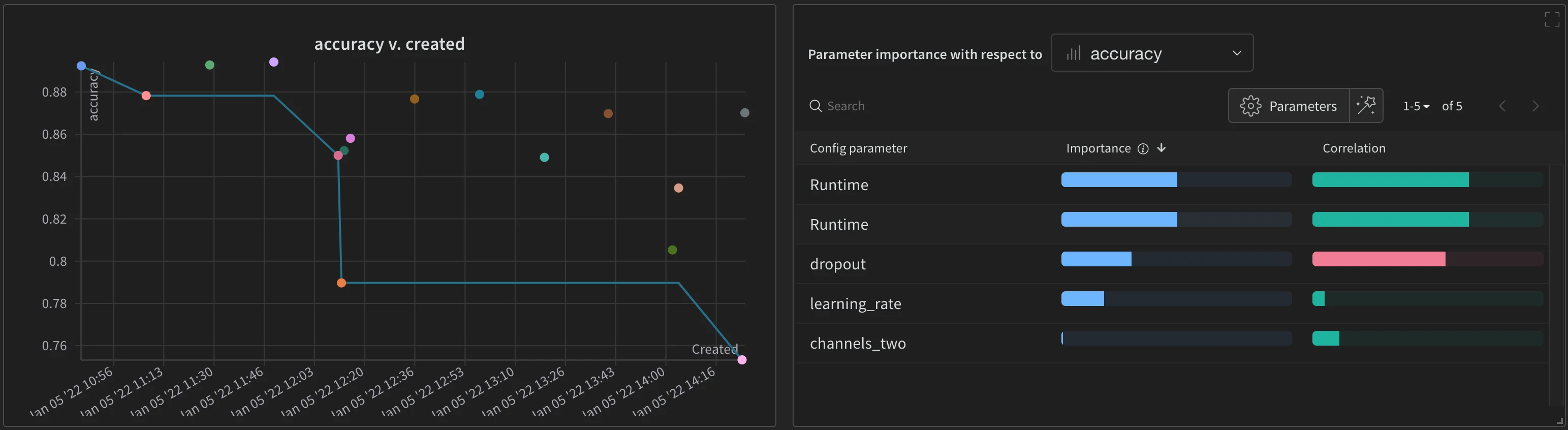
Scatter plot and parameter importance
The scatter plot (left) compares the runs generated during the sweep. For more information about scatter plots, see Scatter Plots. The parameter importance plot (right) lists the hyperparameters that are the best predictors of, and highly correlated with, desirable values of your metrics. For more information about parameter importance plots, see Parameter Importance.